Thursday, 31 December 2015

Font Analysis: Contents Page

Style:
I will continue to use both serif and san-serif fonts in the contents page of my magazine.
As you can see on this Billboard contents page, they have mostly used a san-serif style of font. The style of font of this page differs to what Billboards front page usually has in terms of the style of font used. Even though the style differs from Billboards front cover, their contents page still keeps a simple san-serif looking font which keeps to their magazines professional style in terms of font. I will carry on using san-serif styles of font.

Font Type:
The main font type shown on Billboards contents page is a san-serif style of font. On the front page of Billboards cover they frequently use a range of both serif and san-serif fonts.  However, on their contents page, the serif style of font is not featured. I will thus consider this when creating my pop magazine contents page to carry on following Billboards common conventions. I believe the san-serif font creates a professional feel for Billboards contents page. This is also important in terms of Billboards primary target audience who range from 16 upwards and expect a professional feel to a magazine targeted for them.

Range of Fonts:
Billboards contents page a range of different sized fonts. For their contents page headline, they have used a fairly large. This is a common convention of any magazine to have their masthead or headline in a larger font than the rest of the fonts on the page.
The blue cover lines stand-out to the reader, complimented by the short text of information below it. They have presented the cover lines is a slightly larger font than the text to allow the reader to clearly see what the information below is about and if it interests them.
The other piece of font which is clearly shown on the page is the subheading saying, "Home Front." This is a typical convention of any magazine when writing a subheading to show another piece of information.

Size:
The large font of the heading is a common convention in any style of magazine. Having an effective and large heading on your contents page will stand-out to the reader and allow them to see what page they are currently on in the magazine. The small text print showing information below the blue highlighted cover-lines is also a common convention of a music magazines contents page. It allows the magazine to look more professional. This will be a key aspect in my pop magazine as I want it to look professional for my primary target audience.

Colour: 
As you can see on Billboards contents page, the main colour which stands-out is the blue from the cover lines. There are also pieces of blue strips shown along the page. This keeps to Billboards common convention of having a colourful front page. Using a bright primary colour on their contents page allows the dark, secondary colours to stand-out more effectively as it wont overcrowd the reader with one single colour palette. The black text contrasts well with the blue cover line. When designing my magazine, I will think about having both secondary and primary colours to make my contents page to stand-out. This will also allow me to continue to follow Billboards typical codes and conventions.

Case:
Unlike Billboards masthead, they have used all capital letters for their contents headline. This is effective in allowing this page to stand-out. Also, Billboard have shown the blue cover lines in capitals. This is also an effective element of Billboards contents page as it allows their chosen information to stand-out more clearly to the reader. I will think about how capital letters are used in my pop magazine contents page as it clearly works effectively on Billboards.

Font Analysis: Front Cover


Font style: 
The font style which I will be using on my cover will be mainly a san-serif style of font. My masthead will definitely feature elements of a san-serif style of font. I want my magazine to look professional which is important considering my target audience is primarily targeted towards people aged 16 to 25 year olds. This links to Billboards font shown on their masthead. Their font is of a san-serif style which I believe adds a modern but also professional feel to their magazine. 

Font Type:
As you can see from this front page of Billboards magazine, they have primarily used san-serif style of font to present the content on their front page. However, they is also a good use of serif style font shown on this front cover. Selena Gomez's name is shown in a serif style of font. Also, the main cover line below her has serif elements implemented into it. Because Billboard have used both san-serif and serif style of font, I will also use this in my magazine to follow their typical codes and conventions. 

Range of Fonts:
On this front cover of Billboards magazine, they have used four different font sizes. This is a typical convention of Billboards magazine. They primarily do this to allow the audience to clearly see the information and to keep a professional feel to their magazine. I will also follow Billboards typical convention of only using around 3 to 4 fonts to keep that professional feel on the front page of my magazine. 

Size:
The font sizes on this front cover of Billboards magazine varies. Their masthead is typically large which follows the common conventions of other music magazines. Their main cover-line saying 'Finds Her Voice' is the next biggest font on their front page. This is also a common convention on a front cover of a magazine. Typically, the smaller sized text on the page would typically associate to the reader that this is explaining information either about Selena Gomez or other bits of content in the magazine. 

Colour:
Typically, the font colour of a magazine is primarily based on what the background colour is. As you can see, Billboard have used only the colour of white for their masthead and the pieces if information around Selena Gomez. This allows their text to stand out from the quite dark background Billboard have used. Also, Selena Gomez is wearing white and black clothing. The white of her clothing matches Billboards text, creating a professional feel to this front cover. This is a typical convention of a magazine where they match the colour of their text to a piece of clothing shown on their highlighted artist. 

Case:
As you can see from Billboards masthead, they have not used ant capital letters. You would normally associate a masthead with having capital letters to allow it to stand-out on the page. However, I believe Billboards masthead still stands-out very effectively to me and is an idea I will consider for the masthead of my magazine. 
A sentence case has been used for Selena Gomez's name. This is a typical convention when writing someones name. Billboards main cover-line however uses capitals. This is interesting because Billboard have chosen not too present their masthead in capital letters. Maybe they are trying to allow this main cover-line to stand-out  more than their masthead to pull the reader into purchasing this magazine. I believe in my magazine I will use a range of capital and lower-case letters to add a diverse approach to my front cover. 


Wednesday, 30 December 2015

Sub-Genre: Codes and Conventions

Front Page:
  • One main image featuring the main artist appealing readers to this magazine.
  • The image of the artist will be shown in front of a mainly dark background featuring the colour of black.
  • The artist will be shown in bright colours, however they're colour palette will match the dark secondary colours situated on the page.
  • The masthead at the top of the page will be big and bold, with either a red or white font to allow it to stand out in front of the dark background. 
  • The colour scheme for the fonts on this page will be mainly colours of white, red and maybe a light green colour.
  • There will be a mixture of different sized fonts and use of capital and lower-case letters to present the masthead and various cover lines. 
  • I will stick to the same style of font, which will most likely be a sans-serif style of font.
  • The barcode will be situated at the bottom of the page with the date, issue number and price shown sideways on the barcode. 
  • The content will include trending and popular artists; trending songs from the charts and celebrity stories e.g Celebrity Q&A?
Contents Page:

  • There will be a total of four images on the contents page relating to the artists and content available in this magazine. 
  • The sizes of the images will vary depending where they are placed on the page. 
  • There will be short descriptions next to the image explaining about what this article is about. 
  • Page numbers will be shown on the images to show what pages these articles are on.
  • The background of this page will stick the front pages colour scheme of using dark colours. 
  • The font colour will also follow the front pages colour palette of whites and reds to keep a professional feel to this magazine.  
  • The font on the contents page will be significantly smaller as it follows the common conventions of magazine contents pages. 
Double Page Spread:

  • This page will also feature a dark background, following the conventions of this magazine.
  • The artist shown on the front page will be shown on this page, signifying to the reader that this is the main artist being highlighted in this magazine. 
  • The image of the artist will be fairly large and will be featured on the left hand side of the DPS.
  • There will be a glow around the image of the artist to allow them to stand-out more clearly for the reader. 
  • The headline of this page will be featured on the right-side of this magazine, most likely in a white font.
  • The size of the headline will be quite large because I want the title to stand-out to the reader, allowing them to be 'pulled-in' to this page. 
  • The subheading will be a lot smaller than the headline.
  • The colour of the subheading will match a colour shown on the artists clothing, creating a professional effect to this pages colour palette. 
  • The text will be significantly smaller compared to the headline and subheading. This also follows typical conventions of magazines' double page spreads. 
  • I will also show the text in the colour of white which allows me to stick to my magazines typical codes and conventions. It will also keep the pages looking professional by using the same colour palette throughout.


Tuesday, 22 December 2015

Target Audience Survey Results

From the 62 responses from my Survey Monkey result, the percentage between female and male responses is exactly a 50-50 percentage. This is important as it allows me to target my pop magazine at both genders, which is what I was initially intending to do.

The majority of people who took my survey are of the ages of 15 to 17 year olds. However, there is also a high number of people of 18+ who took my survey, which a percentage of around 48%. These results are an accurate representation of my demographics and how my magazine will primarily target people aged 16 to 25.

My survey results have a total of 82% of people who say they like pop music. This shows how pop music is extremely popular with the young and parts of the older audience, based on other results in this survey. This is important as it allows me to confidently create a pop genre magazine based on the target audience and the features which accompany it.

From my survey results, you can see how the majority of people have chosen colours of black, white and grey for my pop magazine. I am pleased with these results because I was initially hoping to use mostly dark, secondary colours. I believe using these choice of colours will allow my magazine to look more professional based on the typical stereotypes associated with darker colours and the instant professionalism they bring to any high-end product.

As you can see from these results, the content choices of English and American artists were the substantial choice. I wasn't surprised by theses results. In popular pop magazines such as Billboard and Top Of The Pops, trending artists are continually used to draw in their primary target audience. Because of this, I believe my magazine will be able to draw in various target audiences based on the use of having trending artists, both American based and British.

 For my final question on my survey, I asked what title (masthead) would be best for my pop magazine. Ultimately, the majority of people have said they want Vision as the name of my pop magazine. I firstly struggled with this question and deciding what names would fit appropriately for the genre of this magazine. However, I am happy with the result of this question. I believe the name Vision not only is suitable for my primary target audience, but it gives the magazine a professional and 'fresh' feel to it.

Thursday, 10 December 2015

Representations and Stereotypes

Gender
  This Pop music magazine front cover links to the theory Laura Mulvey proposed that women are "erotic objects of desire". This women is shown with her shirt open, revealing her bra to the reader. Women are used as erotic objects on magazines to ultimately gain attention from the male target audience. Using sex to sell is one of the most common tactics                                                  used on any media product. Using women as erotic objects on a magazine cover may also influence sales as it allows itself to also be targeted towards the male audience instead of just females. 
Since 1975, times have changed from just women being eroticised. Men are also now used as erotic objects to appeal to the female audience. This suggests that both genders use their sex appeal to boost the sales of certain products.

Females may also be attracted to this image because they may feel that they want to be seen as sexy and attractive women themselves. This ultimately allows a bigger mass market for this magazine to appeal to which will boost the number of sales.

I would represent this artist by using a female or male model and will then remove key sections of clothing which would then allow me to follow Laura Mulvey's 'erotic objects' theory. Using a male or female relating to Laura Mulvey's theory will instantly allow me to target my model at either the male or female target audience.

Youth

Theorist Stanley Hall puts forward the point a theory known as the 'Storm and Stress Model'. Hall argues that all young people go through some degree of "emotional and behavioural upheaval". He also argues that youth must have "excitement" otherwise they will turn to more prone enthusiasms such as sex, drink and drugs.
These typical 'negative' stereotypes of the youth allow magazine publishers to sell their magazine to the youth because they can make the magazine look edgy and rebellious. This will ultimately appeal to the youth target audience because they will find 'rebellious' people more interesting to read about than some other youth audiences. 

Dick Hebdige's theory which suggests that people of the youth are either 'fun' or 'troublemakers'. 
Parent friendly magazines such as Top of the Pops gives another representation to the youth and links to Hebdige's theory of "Youth as Fun" giving the youth a positive effect instead of just predominantly negative.

I would represent the youth by using the mise en scene as my main profile to my models to allow them to link to Dick Hebdiges' theory that the youth are either 'fun' or 'troublemakers'. I would use clothing to show class types and also the style of make-up of I were to use a female model. Clothing would vary from more of a street look which would also link to Keith Grandal's theory that the lower-class are portrayed as a 'culteral other'. Having more higher-class and 'smarter' clothing would instantly connote to the reader that this artist is of a higher-class based on their clothing styles.

Race

Theorist Sarita Malik argues the point that whiteness has been 'naturalised' when of course its an ethnic group like any other. He also argues that there are still too few black people who actually control the images in terms of directors, screenwriters and producers.

The majority of music magazine covers such as Top of the Pops, Kerrang and NME predominantly feature white artists. This suggests how other races are almost segregated from mainstream magazine such as Kerrang. This supports Malik's theory that whiteness has been "naturalised" and that "multiculturalism is not represented in the British Media."

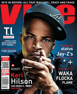
Another thing to consider is that the majority of Hip-Hop artists are black and it ultimately creates a negative stereotype of them. Hip-Hop artists and their fans are seen to be embracing the negative stereotype which links to Stuart Halls theory that the standard image of blackness is being the 'social problem'. However, these negative stereotypes sell, especially to the youth. The negative representations given to Hip-Hop makes the magazine and artists look edgy and more exciting to people of the youth.

I would ultiamtely represent this artists with the connecting stereotype by using a black artist portaryed in their natural clothing. This will also again allow me to use mise en scene to allow the target audience to create their own stereotypes as to what kind of class this black artists is.

Sexuality
In the Media, typical stereotypes of sexuality are used in the media to explore ideological positions about sexuality. Theorist Andy Medhurst says, "Films and television comedies are full of gay men as effeminate screaming queens." Medhurst also argues how typical gay male behaviours are inflated to define their male characteristics of male homosexuality. This allows the media to create a more recognisable image for people to identify different sexuality's.

Medhursts' theory of 'screaming queens' does not just necessarily mean 'all gay men are like that', it's implying that 'all gay men are like that and aren't they awful'.
Medhurst argues that this is done to make heterosexual viewers feel safe in the belief that there way of living is the most natural. This allows the straight viewer to feel more safe and superior to other sexuality's, such as male homosexuals.

This is why Medhurst argues how stereotypes of sexuality strive to create two 'polarised' sexuality's (hetro and straight). This again links to the medias text of the 'screaming queen' and his female equivalent, the 'butch dyke'.

I would represent this artists by again using mise en scene as my main portrayal and strereotype as to what sexualtiy my male or female arists is. Medhursts' theory that homosexuals are portrayed as effeminate screaming queens throughout various films and television programs ultimately makes it easier for viewers to identify if that person is of the homosexuality or not. Trying to show someones sexuality in one image, unless you know their sexuality, is harder to identify.


National/Regional Identity   


Theorist Andrew Higson writes, "Identity is generally understood to be the shared identity of naturalised inhabitants of a particular political, geographic space - this can be a particular place or region."

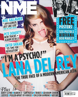
One classic example of this in a British music magazine of connoting it is a magazine for British readers is using the Union Jack flag and colours. This is evident on this front cover of NME in which they show the American flag behind popular American artist Lana Del Rey.

I would represent an artist which clearly showed their regional identity by adding in some sort of symbol such as the American flag to an American artist to show their regional connections.


Class


Even though the artists shown on the covers of music magazines are evidently wealthy because of their success, however they are shown to appear 'poor' to allow there target audience to relate to them. This relates to Keith Gandal's theory in which he states the lower-class are portrayed as a "Cultural Other".

I would represent this artist by again using the rise en scene in which I could show the audience a basic assumption of the persons class. Again, like I said before you would vary the artists fashion sense with some of the typical fashion styles which instantly connote to the audience a persons typical class based on their fashion style.


Sunday, 6 December 2015

What I Have Learnt and Target Audience for My Magazine

What I have Learnt
In my Pop genre magazine, psychographics and demographics will feature heavily in my magazine. I have learnt that my demographics will allow all people aged 16 to 25 to connect with the content and chosen style I intend to do my Pop magazine in. I also have summarised what social grade my magazine is targeting itself to.
In terms of psychographics, I aiming predominantly going to target my magazine towards the Aspirer and Explorer. I believe play around with the colour palette of my magazine because both these groups are evidently adventures and are willing to explore both trending and future Pop artists.

My Target Audience:
For my chosen magazine genre of Pop, I have ultimately chosen to aim it towards the psychographics of the Aspirer and Explorer. I have firstly chosen to target my Pop magazine at Aspirers because criteria brief. Their criteria of image appearance and attractive packaging is a major aspect of Pop magazines. You associate Pop magazines with bright, primary colours which allow the young and also older age ranges to become appealed to it. Images of trending and currant artists are one of the main appeals to a Pop magazine as it allows the reader to discover more information about them which is one of the main selling points situated around the front covers of Pop magazines. You ultimately use different artists for certain age groups and genders. For instance, Top Of The Pops magazine use artists such as Jessie J and One Direction to allow their target audience of 11 to 14 year olds to instantly want to discover more about these artists.
Another reason why I have used the Aspirer is because of their appearance criteria. By focusing predominantly on the appearance of the magazine, it allows myself to play around with the colour palette, allowing myself to venture certain colour schemes which I normally wouldn't use.

For my next psychographics, I have chosen the Explorer. The Explorer is associated with energy and an instant effect to try new brands. Energy is a massive part of the Pop genre. You associate the young, energetic audience with the Pop genre which will be an effective aspect of my Pop magazine.
Not only is energy a significantly important aspect of the Pop genre and ultimately my magazine, but their willingness to try new brands is a major aspect of the Pop genre. Allowing themselves to discover new and trending artists allows them to become recognised in the music industry with the effect of publication allowing their talent to grow with audience appeal.

The target audience of my Pop magazine will target people from the ages of 16 to 25. I believe the target audiience I have chosen is slightly higher than what you would normally associate to a Pop music magazine. Existing magazines such as Top Of The Pops who target their magazine towards the age ranges of 11 to 14 year old females allows the content and colour palette of their magizne to be a little more extravagant and adventures. I have chosen this specific target audience because I want my magazine to have more of a professional feel to it. This will be shown using a mainly secondary colour palette which I believe instantly gives a magazine that professional feel. This will also be shown with the use of content present in my magazine. I will show content such as celebrity artist storylines. This I believe allows the reader to connect more with that celebrity's personal life and could possibly relate to it, creating a second person feel to this magazines content.

The audience I'm targeting my magazine at will be primarily British people, however my content and style will be made to ultimately target all different nationalities. My target audience in terms of sexuality will be aimed towards straight, bi, gay and transgender people. This, I believe again illustrates my point that I'm targeting my magazine towards various different target audiences which I believe also adds to the professionalism of my magazine.

https://www.surveymonkey.co.uk/r/W3CJRY3 - Please can you fill out my survey.


Friday, 4 December 2015

Psychographic Target Audience Profiling

I believe the Pop music magazines appeal to only three main psychographics. The first one the Pop genre appeals to is the Aspirer. Their criteria of image appearance and attractive packaging over content quality matches the Pop magazine genre. Pop magazines are associated with having a bright colour palette, with the images of trending and currant artists being the main appeal.

The next psychographic which links to Pop music magazines is the Explorer. The Explorer is associated with energy and they have an instant effect to try new brands. Not only is energy associated with the young target audience, but the willingness to explore new brands is important for the Pop genre to allow new artists to become recognised with the audiences appeal.

And finally, I feel the Reformer psychographic links to the Pop music genre magazine. I believe freedom from restriction allows them to connect to many genres including Pop. Also, support growth of new product categories allows them to appeal to currant and new artists allowing them to grow in the music industry with popularity.

Wednesday, 2 December 2015

Audience Research and Profile


 The target audience for Top Of The Pops magazine is predominantly young girls and pre-teens. TOTP's magazine is predominantly read by females with a statistic of 85% female readers. Their magazine has a readership total of 298,000, with the age range ranging from 11-15 years old. TOTP's social grade would be fairly high due to the amount of parent consumers paying for TOTP's publication and that is why the social grade is C1/B.


Billboard: Billboards magazine has a total readership of 48K. Overall. their magazine is aimed towards both genders which is dependant on the cover star. The age range for their audience varies from 25 to 54 year olds with a social class of A-B.


We Love Pop: The primary target audience of WLP's magazine is teenage girls aged between 13 and 15 years old. We Love Pop is published by Egmont UK and has a circulation of around 115,000.
The social class of We Love Pop's is most likely to be ABC2 demographic. This I believe is predominantly based upon parental income and demographic.

Example Audience Profile: Demographics

Profiling My Target Audience 
Genre: POP

Class/Earnings: My primary target audience will consist social grades of C1-E.

Age: 16 to 25

Nationality: British

Ethnicity: Primarily White British

Sexuality: Straight, Bi, Gay and Transgender

Audience Appeal: My target audience will appeal to people who are interested in currant and trending pop artists.