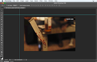
Here is the beginning of my editing process. I have used the image I mentioned before in my research. I felt this image was able to show what type of genre are film is, and also it gives the audience a 'teaser' into what events will take place in this film. The colour I felt was very warm, yet had a cold tone to it which I believe is down to the fact the explicit content shown in this image. This also allows audiences to know whether or not this genre type suits their film taste just by looking at the picture.
In terms of the picture itself, I like the dark-red of the blood dribbling off of the knife. It adds a sinister tone which is something I was looking to achieve for the overall tone of this page. I wanted the reader to instantly feel intrigued and questioning themselves as to what has happened, primarily by looking at the picture. I also like the general photography used in this picture. The focus on the knife, complemented with the out-of-focus background allows the knife to stand-out very vividly to the reader. Zack (Director of Photography/ Cinematographer) captured a lovely looking shot which I believe works perfectly as a starting point for my double-page-spread.
Another aspect which I have added is the White Lies title which has a black rectangle on it. I was inspired by the double-page-spread of Skyfall I analysed for my conventions of magazines post. I like the modern feel of it and the fact it's a bit different to how other film titles are normally shown in film magazines. I also like the bold looking font I used. It allows the title to stand-out very effectively to the reader and the font I feel looks very professional looking, while at the same time keeping a stylistic element to it. Also, the colour palette of the White Lies title, contrasted with the colour palette of the background goes together very well.
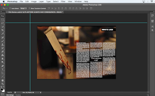
 Here, I have begun to add pieces of my text which I did a draft of before I started editing my double-page-spread. I want to ultimately add three columns worth of text which will allow my DPS to look in depth and professional for the higher age-groups which I am primarily aiming my DPS to. The green lines shown on the screen I used to find the centre of the page so I was able to measure how big each column had to be to be able to fit three in. This tool has allowed me to develop my Photoshop skills even further as I was unaware this tool was available when I first used photoshop. This has ultimately allowed me to develop my skills to a higher level in Photoshop which I hope will contribute to allow future work to look even more professional.
 I have now been able to create three columns of text which I feel look very stylish and professional on this double-page-spread. The white text allows my writing to stand-out effectively to the audience and allow them to clearly read the review I have wrote. I haven't yet finished the writing side of my DPS, however it is very close to being completed. I have also added a quote in between the text of the middle-column of text. This is a common convention of many double-page-spread magazines and felt it added a professional stylistic feature to my magazine which is something I initially wanted to achieve. Even though I like this feature, I don't like the font I have chose. I feel it doesn't fit the style of the page I'm aiming to achieve. I will therefore go back and test out a few different fonts on Photoshop to see which one looks the most appealing.
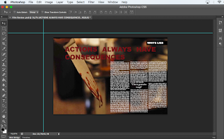
For the next steps of my DPS, I have added the main headline which says 'Actions Always Have Consequences'. I like this title because it has emotive language which relates to certain emotions featured in our short film. I also like it because it gives almost a 'teaser' to the reader because they are now thinking about what consequences might have accused in this film, almost a rhetorical question to the reader to get them thinking. However, even though I'm happy with the headline I have chosen, I don't like the font or colour I have used to present it. The font itself looks 'cheap' and ultimately doesn't fit the style of this double-page-spread. The font hasn't got that stylish vibe I was initially looking for. It doesn't draw me in to this page, so the reader definitely won't be interested in this page. The headline is one of the most important aspects of a double-page-spread in allowing the reader to be drawn in to explore the rest of the content featured on that certain page. I also feel the colour doesn't work well with the overall colour palette of this page. It blends in to much to the background and is hard to read unless you focus on the headline itself. I want the page to come together so the reader can look at the page as a whole and be drawn into reading it. I don't want their to be any aspects which go against the professional connotations this page I believe has the potential to have. Ultimately, because of this, I will test-out different fonts to see which stands-out the most effectively on my double-page-spread. Once I have chosen my desired font, I will then test out various colours to see which fits the overall colour palette of this page, but also allow the headline to stand-out distinguishably and appealing to the reader.
Firstly, I have now changed my headline and the colour. Before I had a red headline which ultimately looked very cheap. I have now changed the boring looking font I originally had to the 'haettenschweiler' font which I believe creates a much bolder and intriguing effect. The font itself is quite stylish and original compared to other conventional fonts of other film magazines, which I feel works well with the rest of the page. I also like the way the headline is positioned compared to how I had it before in the centre of the page. It looks a lot more professional over the top of the three columns of text. I would also like to add a section in between the headline and text which has information about the cast of this film such as the director, cinematographer etc. I feel this addition would make the page look even more professional for the higher age ranges I'm primarily targeting my magazine to. It also allows audiences to go into more detail about the specific aspects of this short film, other than just the review. I have also changed the colour of the headline to white instead of red. I believe the white stands-out much more effectively compared to the red headline, and it also fits the primary colour palette of my double-page-spread. Overall, I am very happy with my headline and feel it gives the page a professional and sophisticated quality which is what I was aiming for.
Another aspect which I have changed is the font of the quote featured in between the middle column of text. Before, I felt the font didn't fit the overall style of the page and ultimately looked out of place on this double-page-spread. I have decided to use the 'britannic bold' font because of the way it stands-out very effectively on the page. You can now clearly see the quote in between the text and I am instantly drawn to it which is the effect I wanted to create. I have also made the font bolder, which in tern is another reason why it stands-out so effectively on the page. Another small change I have made is moving the 'White Lies' film title to the other-side of the page. I did this to ultimately fit the main headline over-the-top of the column of texts to make it look more professional. However, I believe the title still gives off that stylistic element which is what it was originally intended to do.


proficient skill in the use of digital technology or ICT in the presentation.
ReplyDelete