Here is the beginning of the editing process for my short film poster. I have decided to choose black for my background based on my research of other thriller/action short films. Normally, the common conventions of a thriller short film poster use predominantly dark, secondary colours to advertise themselves to a specific audience.
I believe the black background is the basis for the audience in terms of them understanding what kind of film this is. The dark colour instantly gives you a mysterious and dark tone to this poster. I also felt the black of the background relates to our coffee table we used in the film. The table we used was black and glossy, which could also be the background. Instead of just being black, I could add more of a glossy effect to it to make it look more like the coffee table we used.

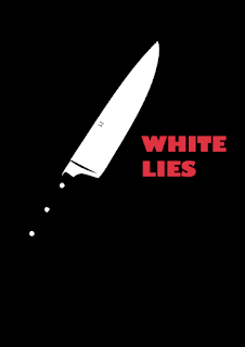
Here is the next step of my film poster on Photoshop. I have added an illustrated knife to my poster. I wanted my poster to originally have a graphic and illustrated style to it, so I could explore different styles of this poster more creatively. I firstly took a picture of the knife (which you can see in my planning) and then I put it in Adobe Illustrator and 'live traced' the image of the knife to create an illustrated effect, which is what I wanted to achieve.
I like how the white of the blade stands-out from the black background. The knife is a very significant attribute of our short film. I wanted to show the knife on my poster to create a contentious viewpoint from people about what their initial thoughts are on the film, based on the illustration of the knife.
Ultimately, I am very happy with the outcome of the illustration and believe I will keep it in for my final design.
Here is the next step of the creation of my poster. I was a bit sceptical and critical about which font would fit in with the genre of this short film and the tone of the poster.
I felt that the black background, complemented with the illustrated effect of the knife, gave my poster a kind of Alfred Hitchcock feel to it. Therefore, I wanted the typography to look more classical, rather than the more modern day fonts conventionally used on thriller film posters, such as Logan.
I searched through and tested many different fonts, but I eventually settled on the Gill Sans Ultra Bold font. I feel this font brings elements of a classic 1950's looking font, which is what I was aiming for. I believe the red of the font adds another element of effect in terms of colour on my poster, and it also connotes to another theme in our short film.

proficient skill in the use of digital technology or ICT in the presentation.
ReplyDelete